The rhymes with ‘Cone’ version can be pronounced in a posh or a common way whereas the the ‘Gone’ version is simply neutral.
I wonder how many have actually ever considered this ![]()
Another fascinating video → which contains several maps + the source of the Amazon!

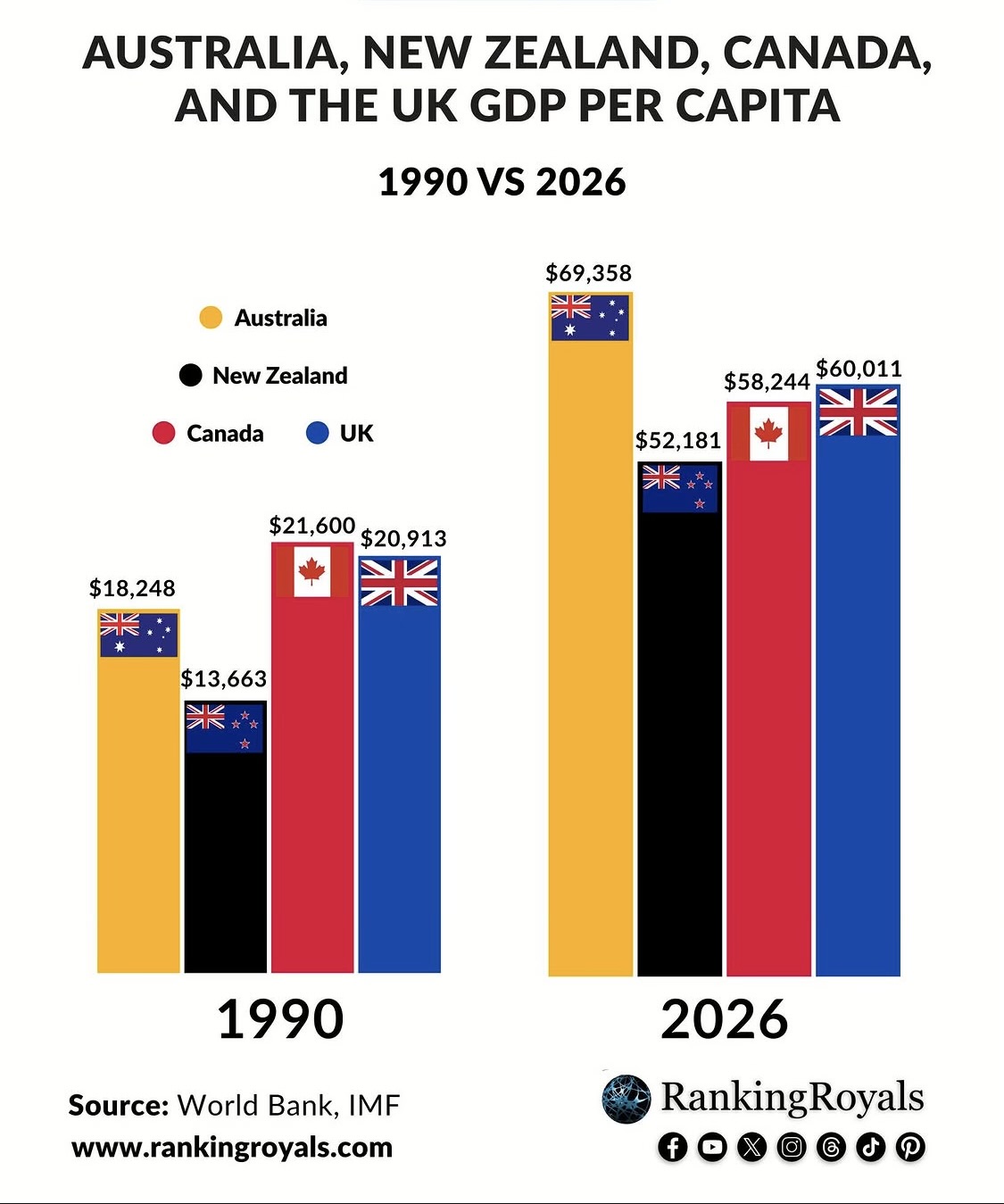
Interesting but I’m baffled by that one. I thought Canada would be much higher given its oil and mineral exports.
We have minerals and gas as well as the normal stuff
I am confused by these stats Pete. I googled “average Australian working man” and the following image came up. I am guessing the guy on the right could be you?


It is a very narrow and can be a misleading measurement. Worth looking up.
Australia has plenty of minerals too, and still mines loads of coal, produces gas, etc. It also has a lower population than Canada.
I wasn’t surprised by Australia’s numbers, but by Canada’s. I suppose it does come down to the population figures.
Yes, you can prove anything with figures if you want to. The thing that surprises me most is the way that the UK appears to have crept up the rankings. Given its spiralling population and low productivity I’d have expected it to be lower.
Perhaps a gradual shift to higher value added services sectors in the uk has produced some sort of effect over the longer term. I guess the City and various supporting industries might skew the figures? It’s complete guesswork on my part though.