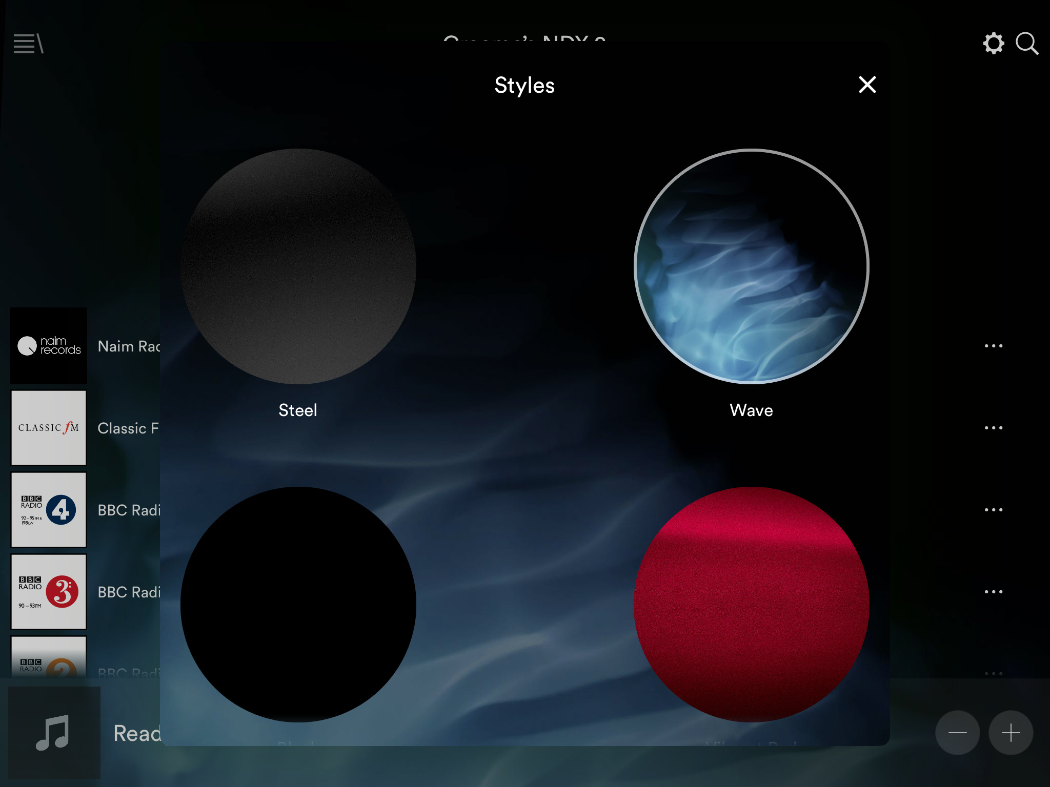
I can’t imagine using anything other than ‘Wave’. What about you?
G
Black !!! what else.
I would love to have a Naim Green, but it means the icons would need to be transparent to avoid ugly black boxes
(this is a photoshop showing what I mean by transparent icons - BBC R3 & the ugly black boxes)
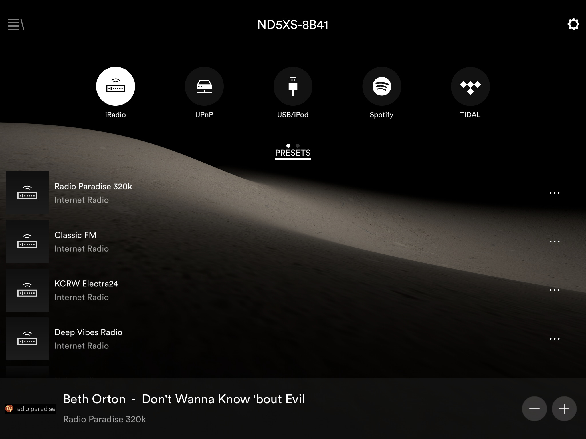
I go with the steel…
Perhaps add a poll option.
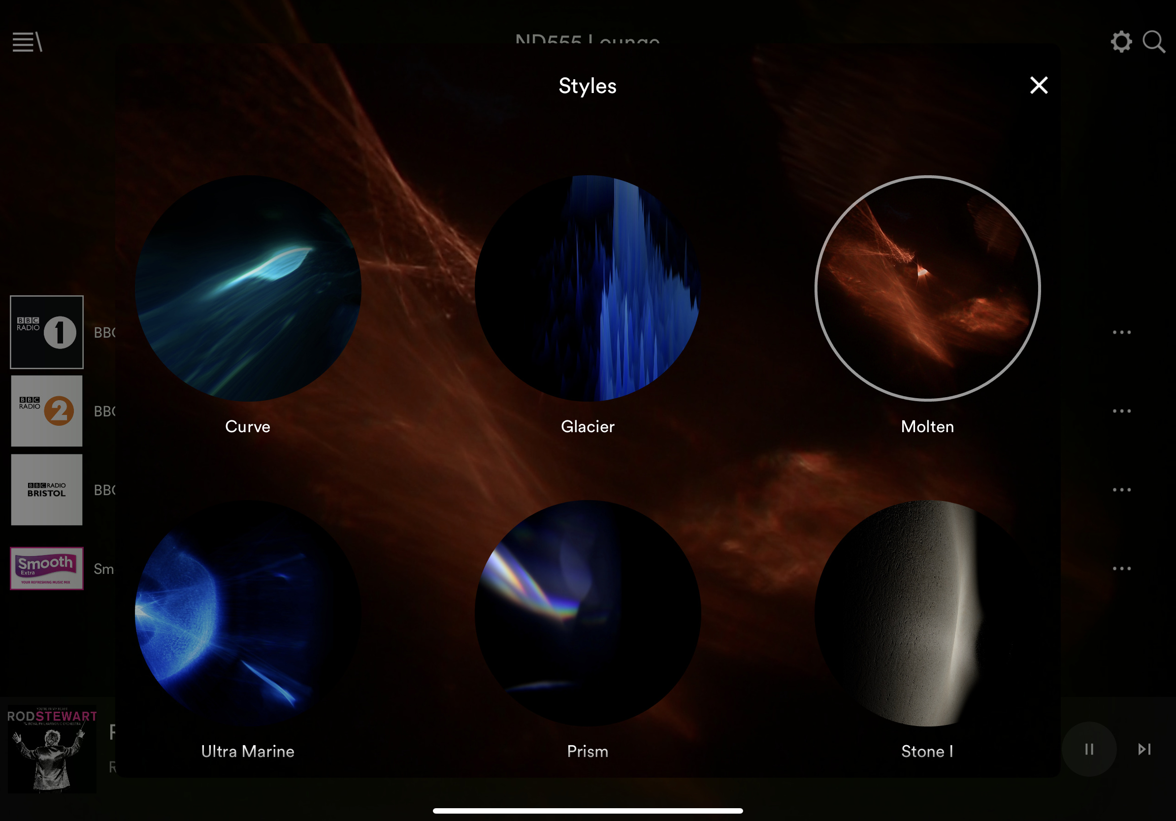
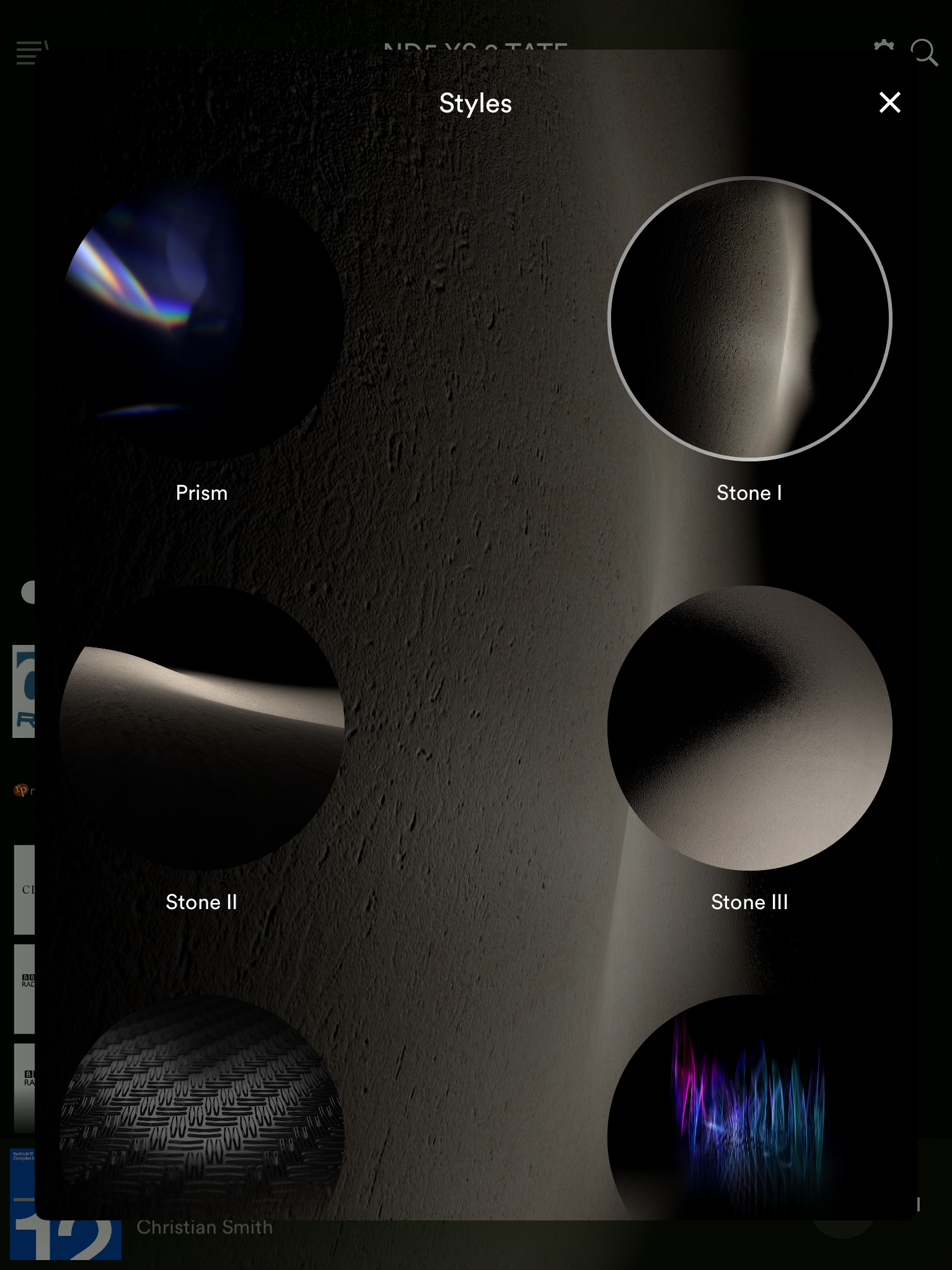
I’ve pushed the boat out and moved on from Wave, now I am enjoying Stone 2, mainly because it reminds me of the Moon in Space.
…actually I did change it awhile back to ‘Stone I’ and forgot I had made the change. The old memory is not what it used to be.
Interesting, that begs the next question. Are you a Portrate man or a Landscape man? I am a Landscape man everyday of the week.
I have tried all the styles from the Naim app so far, not sure yet which one I prefer. Stone l is my current choice, probably because I’m finding the ‘back ground’ album/song writing easier to read.
Steel works fine for me. Although I always preferred the old n-stream (remember that?) default.
And it’s portrait in my iPhone, as that’s all that is offered, but I prefer landscape in my iPad.
Best
David
That would look ok except for that annoying blue streak…
That’s kind of the thing I like ![]()
so it’s good that there are choices…
Black, black or black - all work well for me!
Glacier was my first choice when i very first ever setup my ND5 XS 2. I sometimes go back to it for nostalgic reasons.
Sigh
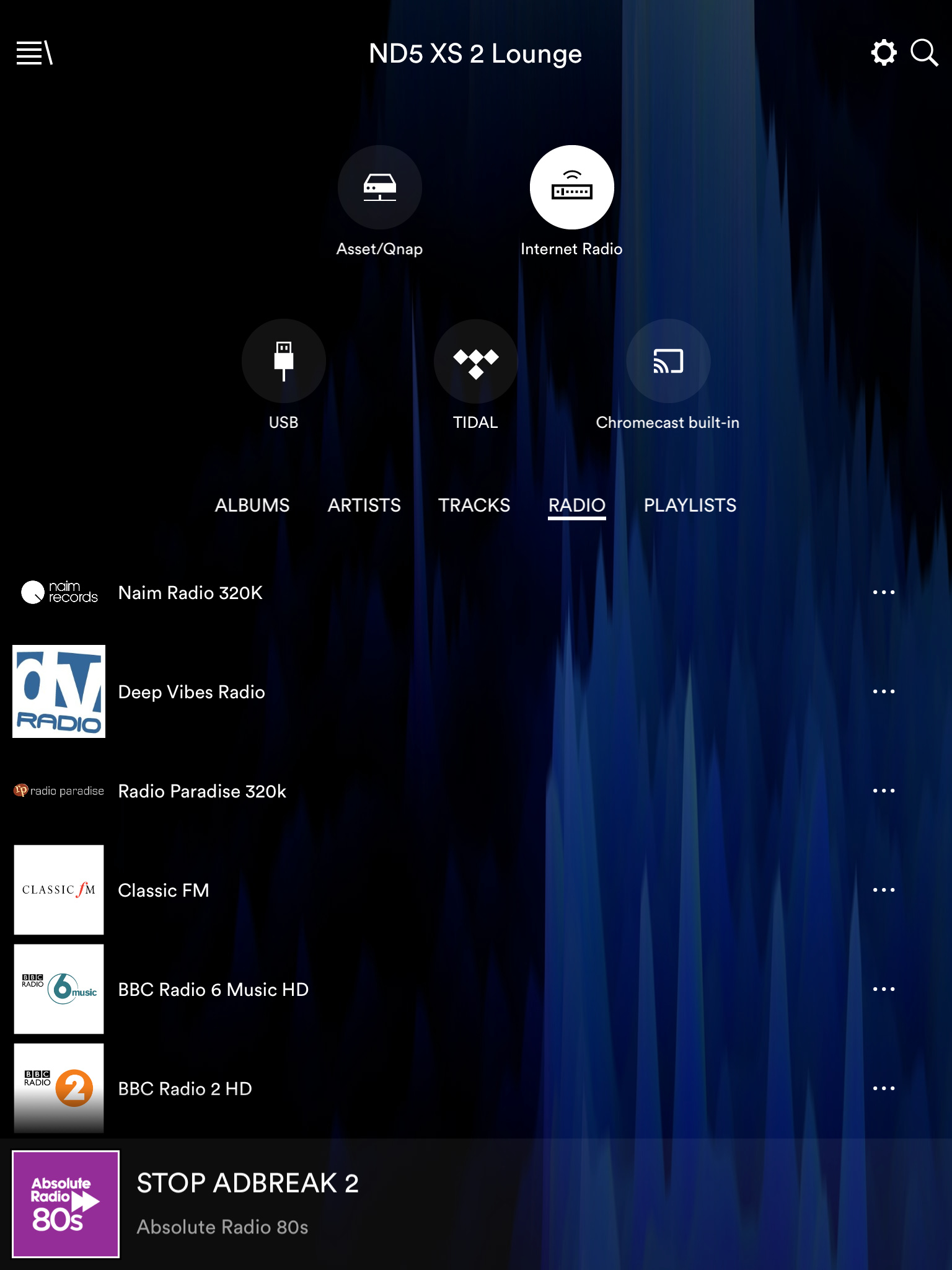
Agree about Absolute 80s👍🏽