That looks very smart - official images of the new aesthetics haven’t really convinced me.
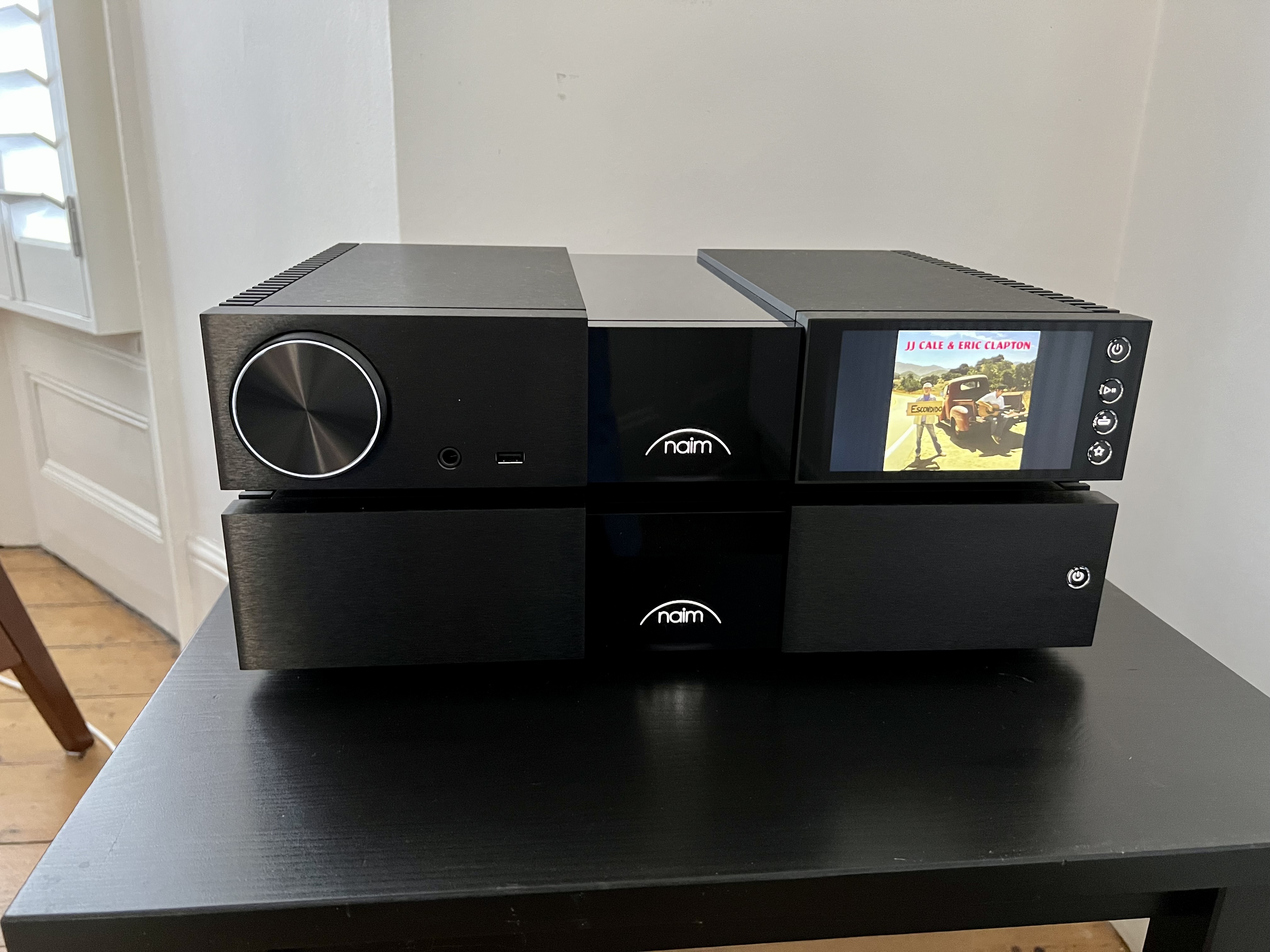
I find the green vs white debate quite funny, actually… just upgraded my ND5XS2 + SuperNait 3 with the new NSC 222 + NAP 250. Not disappointed, and a lot of thanks to Ben and Jack from the AudioBarn near London who organised a perfect A/B comparison for me a week ago.
I can see that, but when you have a lot of older green lit products it would be nice to have an option for for newer items to match.
I get that, of course… I went from 2 boxes with green logos to 2 boxes with the white ones, so nice and neat. Easy, and sounding fab!
I have been a Naim owner since the late CB period.
The olive stuff were my favorites.
When they changed to Black Classic, I didn’t like the looks.
During years I got used to it and have a few items along with my Olive stuff.
Apart from the very first days of new classic, the shocking prices and the divided cabinet, I went to see and feel them in live.
Wow, they are stunning no less, looks so cool.
If I ever am into that price market…hmm…333/350x2 and psu, this would require the big lotto win.
I hope you’re going to set it all up properly on a dedicated rack, it’ll appreciate it and reward you accordingly!
Audiobarn are exceptional, I’ve also dealt with them, a truly stand out dealer and very forward
thinking.
I know - looking for a decent and reasonably priced rack!…
How do you find the new classic 222/250 to pair with your Kanta 2s? I demo’d a similar system several months ago. Had it at the house for about a week, but found the high frequencies a bit too much for my liking.
There is always going to be a discrepancy between generations of kit from the same manufacturer and with that inevitably come different preferences.
I am not a fan of the new design at all but equally, had I been a fan of the sound, I would have purchased regardless. My Chord DAC was designed by someone very confident in their skill set and apparently no idea that it looks like something designed by V-Tech. Ultimately I like the sound of it and so I can overcome my dislike of the look. Obviously everyone is very different in this respect.
I find myself bewildered by the look of the new kit. It looks plasticky; the middle sections look like the fold out leaves of a dining room table; and the white on the large knobs is wholly unnecessary and somewhat brash/crass looking. As someone with a VI involving light sensitivity then it’s as much as a no no as the shiny Solstice. The feel of the smaller buttons compared to the likes of the classic series are again plasticky and lacking in a solid feel. I’ve no sense I’m going to lose the buttons on my 200 series boxes inside the case but I’ve seen it happen three times now in dealer demos.
The decision for me was simple in as much as the sound did not engage me; the looks certainly don’t and the new price points exclude me.
I would be interested to know aesthetically whether there was any sound reason why the logo and other lighting options could not have their colours changed from within the app as other manufacturers do. That would (possibly) have been an easy win for those not liking the new white look.
The tonal signature is not miles appart from the ND5XS2 / SN 3 I have been using for 3 years or so, so nothing troublesome (for me) there. A good pairing in my opinion, but clearly down to personal preference in this respect…
Well there is nothing that looks or feels plasticky to me - both units are fairly heavy, actually! I have been using an Atom in my dining room for a while, as well as a MuSo and MuSo Qb, so if anything the white logo unifies most of my Naim kit… this is of course a matter of personal preference but to my taste, the new look is very agreeable and a bit more modern. There was nothing wrong with the departing design, to be fair, but I cannot fault the new one… only driving things with the app also means the front fascia buttons are largely irrelevant to me (mind you the ND5XS2 only has a power button on it, nothing else!).
I think everyone is entitled to their opinion on the design of classic/new units etc. - all fine for me.
The worst design falls squarely on the remote - cheap and nasty that attracts dust, dirt and scratches (operationally solid though)!
Already feel better I’ve got that off my chest.
Can those of us addicted to the proper Naim green not get some transparent coloured tape?
Clearly some of the design topics are still a bit raw for some! Well, let me reassure you that I’m quite happy the SQ is not disappointing…

Sorry, I should have been clearer. I meant that in photos ot looks plasticky. Having seen several in the flesh it’s far too shiny and bright for me but it’s obviously not made of plastic.
More accurately, there were red and green LEDs and the logo was a silvery white*, so perhaps we’ve just come full circle.
*or a golden brown if you still have the original fascia on a piece of 1985 Naim kit.
Can the lighting for the knob, buttons, and logo, be switched off? Or only dimmed? I’m still not warming to the aesthetics, I hope it looks better irl.