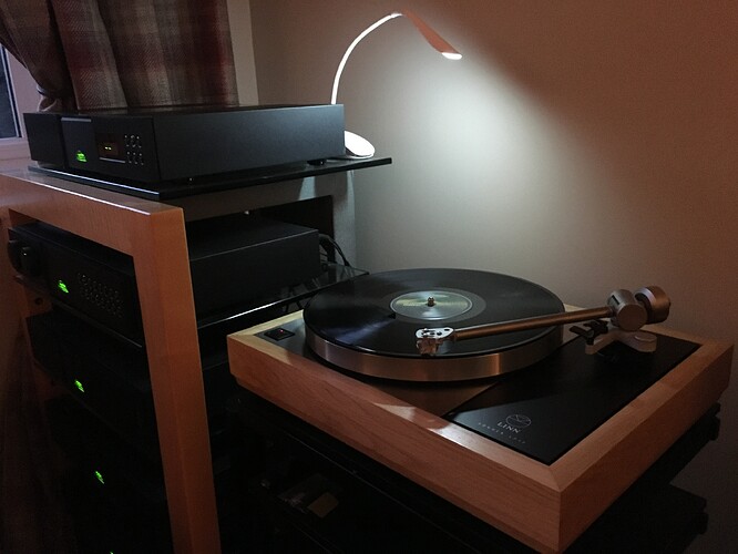
Looks great. I liked these stands a lot. Seemed to be a standard at the time, bu I can’t remember it’s make.
MArco ![]()
@Debs Richard D has kindly messaged me to offer to pass the drawing(s) on via admin, which because of a few ‘catch up things’ I want to do (including being here on the forum) will now be in the morning.
7pm on a Sunday, I think it’s time to relax.
@AlcideNikopol Thank you Marco,
It was an ‘Ash Cosmic’ stand - unfortunately they are no longer available to buy new, only 2nd hand.
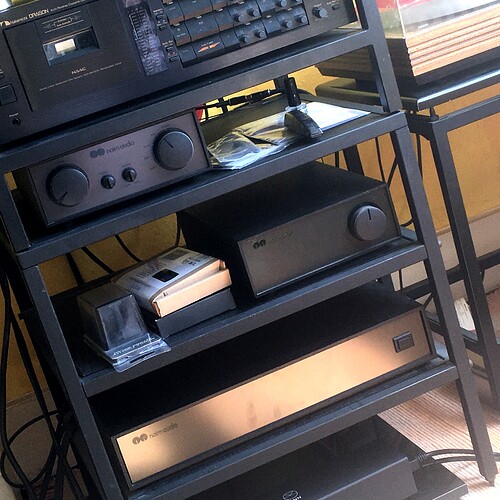
@Debs Apologies for deleting a couple of messages, I felt guilty taking over the thread (well only a bit) so I did some pruning - hence the post above with one of my old systems. It had to be done - though frankly I could use all the likes I can get, now that Dan Steel has gone!
What day is it?
My guess is another one of those hazy stay at home days ![]()
How do you feed the dragon?
Are there any metal tapes today? ![]()
@ditton the Dragon gets fed regularly. I have hundreds of tapes. Metal tapes are still available, but upwards of £50 a pop. To be honest though, the Dragon makes such good quality recordings with quality CrO2 or even ferric (eg TDK AD) tales that metal blanks are hardly necessary…
Nice to remember, in the early 1980s.
TDK MAXWELL AGFA tapes all around the room and waiting for your favorite radio shows or play friends’ records and record them to the B300 ![]()
@Debs Any signs of them, or were they that bad?
Geoff, Debs hasn’t got them yet as I’ve been out working in the fields this afternoon clearing a fallen tree. But they will be sent shortly.
Thank you Geoff, they are brilliant! ![]()
The lunar surface moon pics are really good ![]()
@Debs Very happy to hear that.
A Report. I didn’t want to just reproduce the original but put my own style into them. Hence the details change and B&W version. Hopefully they are almost professional in quality ![]()
@Debs can I request that you don’t distribute/show them anywhere online please. ![]()
Somebody gave me the idea of using the lunar
landscape but I can’t remember who ![]()
My preference is the full mono + moon.
Yes, it’s dynamic, a darker bat with inkier blacks exposed in moonlight.
It would make an interesting table lamp shade design for ones olive audio room ![]()
It’s a nice work of art, however i think they may of got it right for simple logo purposes with the original yellow moon / brown bat version.
Or maybe it’s just nostalgia for originality (?)
@Debs I agree, there was nothing wrong with the original, including the colours, it worked well.
Having slightly unclear references to work from l decided to reshape and recolour the update, rather than make a ‘trace’ copy. Also for my own use I want a graphic not an illustration.
I think of the moon as greyish with a hint of yellow and when I added it into the layout I thought why don’t I try grayscale for everything else too?
Thus it ended up being my favourite, for the reasons you gave, and because the grey tones give it a touch of sophistication. The Moonscape (as you suggested) adds shape, texture and breaks up the ‘cheese’.
I agree it’s my favourite too, however, now the moon has become defined, perhaps the bat would fly better with a real fur coat makeover ![]()
Did you see the cloud’s poster version, because that was very different? I used that for guidance on several areas.

